Lau Legal Services - Logo, Brand, & Website Design
I created a brand for Lau Legal Services in Westford, MA, a tax resolution lawyer who provides legal services for individuals and businesses who have been contacted by the IRS or state agency. This was a challenging project to work on because I didn’t want to use any stereotypical legal imagery. Tim Lau, the owner of the business, has a unique personality and background: he’s very laid back, focused on helping his clients, and quite funny! I didn't want to create a logo with a gavel, dollar sign, or legal scale, I wanted to create something that would tell his story and give people an idea of what it would be like to know and work with him before they even met him.
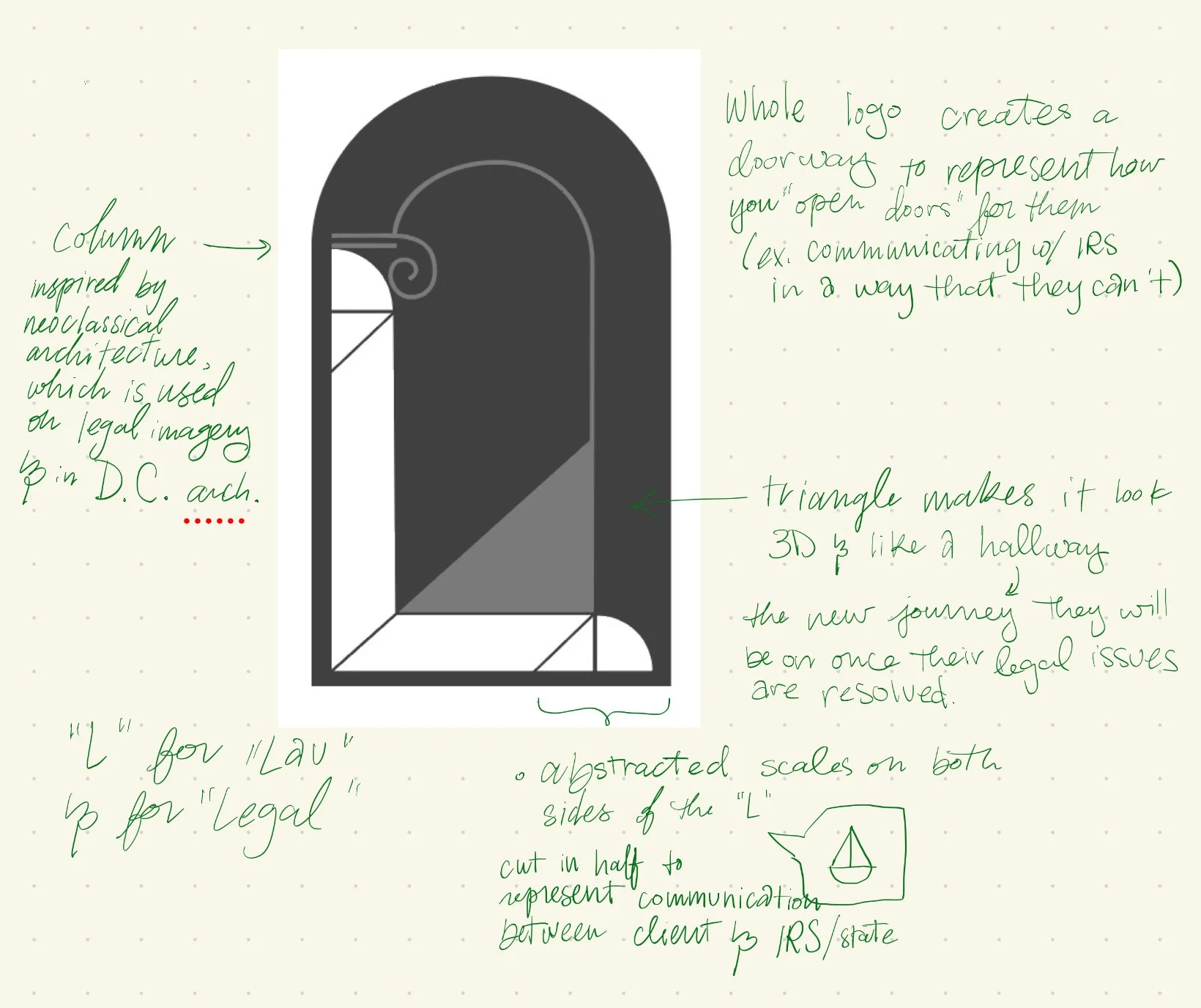
One of my professors in college told me, “every single element of a design needs to be there for a reason. If something is there for no reason, take it out.” So now I write the reason for every element of my logos. This advice has made single-handedly made me a better designer than anything else I’ve ever learned.
This is the second draft of the logo. I’m not sharing the first draft as it was abysmal, but usually a terrible first draft means a great end product. If you can’t read my notes, here’s what it says:
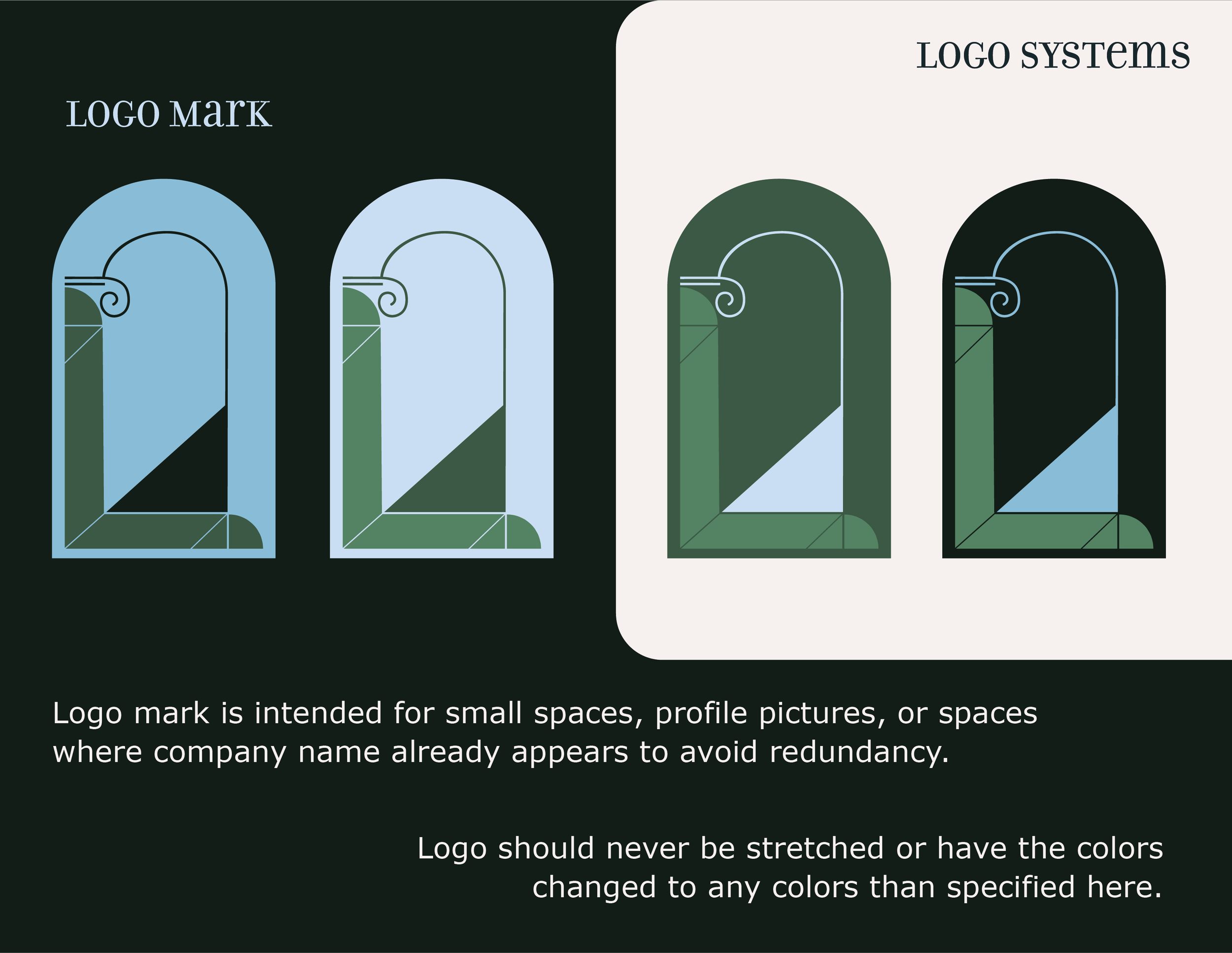
“Column inspired by neoclassical architecture, which is used on legal imagery & in D.C. architecture.”
“‘L’ for ‘Lau’ & for Legal”
“Whole logo creates a doorway to represent how you open doors for them (ex. communicating w/ IRS in a way that they can’t)”
“Triangle makes it look like a 3D hallway -> the new journey they will be on once their legal issues are resolved.”
“Abstracted scales on both sides of the ‘L’ cut in half to represent the two halves of the communication between client & IRS/state'“
note that didn’t make it in there: "Segment on the joint of the ‘L’ leading to the triangle/hallway represents Lau Legal Services & how they will be the connection between client & IRS, leading through the open doorway”