Pregnancy and Postpartum PT: Designing a brand that encapsulates how this businesses is changing lives
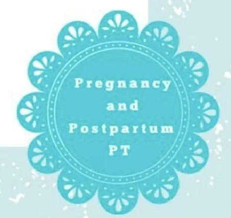
Over the last few months, I have been very lucky to witness the amazing work that Pregnancy and Postpartum PT is doing for women, as well as watch their business grow. At first, Blair (the practice owner), insisted that they did not need a logo (I’ll be doing another blog post on why every business needs a logo, but that’s for another time.). At the time, they were using a Canva design of a circular teal flower shape to display their company name on materials, which everyone called "the Doily." As I worked with Blair and the PPPT team, everyone started to want a logo that they could be proud to show clients. I came up with lots of options but none of them seemed to resonate with Blair.
She had mentioned that she did not want a logo with flowers, helping hands, a pregnant woman, or any sort of pelvis, which left me stumped at first because those are all of the things that a logo for a Pregnancy and Postpartum PT place usually include. Finally, after about 2 weeks of brainstorming, I looked to The Doily for help! I took the little design from one of the parts and played around with it.
One day, a patient who had been in a lot of pain called asking for an appointment and she came in the next day seeming discouraged and anxious. When she came out of the treatment room, she seemed relieved and hopeful. She expressed her gratitude by saying something along the lines of, "I feel like life isn't going to be terrible anymore. Thank you."
That's when I realized what I wanted to highlight with this logo design: I wanted to highlight how Pregnancy and Postpartum PT provides hope and comfort for women who have been struggling. These women have often been on waitlists elsewhere that are MONTHS long for immediate problems, that will cause lasting effects if not treated properly. Care is often inaccessible for women and all of the therapists at PPPT combat that by doing their jobs well and never turning any woman in need of care away. So how did I illustrate that?
Design Process & Results
I took the 5 teardrop shapes from the edge of The Doily, creating abstracted rays over a window sill (the double line on the bottom), emanating hope. It was important that the full company name was in the logo for SEO purposes, so I kept the words, but changed the font and rounded some of the serifs to feel more elegant. I incorporated the words "Pregnancy and Postpartum PT" into the window shape by forming the window sill around the 'P' at the bottom and using the 'P' and the 'd' as pillars. Lastly, I used the color palette from the website in order to create a cohesive brand identity.
Everyone at PPPT was ecstatic about this logo, and since its design, I have seen this business grow in many ways. They launched a strength training program in-office that consists of small group and 1-on1 personal training, lead by personal trainer, Lynne Bourque. Blair also hired another addition to the physical therapist team, and has seen a huge increase in clients since. I’ve been working on marketing our online presence with cohesive, branded content on Instagram and our website, and we have increased our reach to clients online. I can’t wait to see what Pregnancy and Postpartum PT accomplishes next.
Brand Brief
〰️
Brand Brief 〰️


